Jetpack Compose ConstraintLayout
Learn how to work with ConstraintLayout in Compose.
Everything listed in this post is part of Jetpack Compose version
0.1.0-dev13, (Compose Developer Preview 2), so it’s quite prone to change over time while the team keeps improving the api surface.
🧠 Concern separation
When ConstraintLayout was coded for the Android View system, logics for rendering (constraints) were decoupled from the ViewGroup with the purpose of making it also work for the layout editor. That decision turned out to be pretty convenient so it could also be ported into Jetpack Compose now.
🤷🏼♀️ How to use it
You can find it in implementation 'androidx.ui:ui-layout:0.1.0-dev13' and import it like import androidx.ui.layout.ConstraintLayout.
Here you have a fully working example I prepared and I’ll be iterating over in other articles to come.
👀 An example
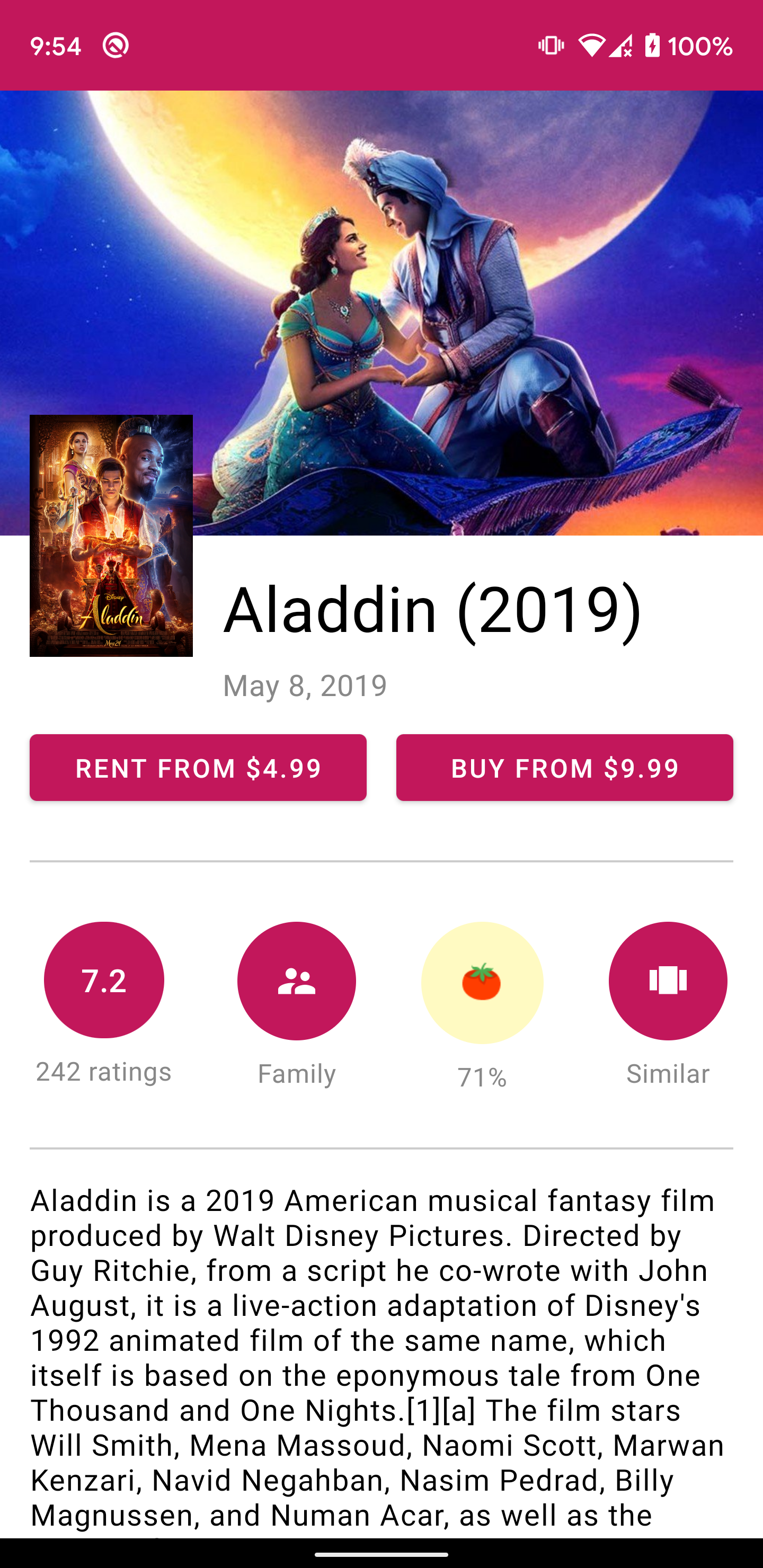
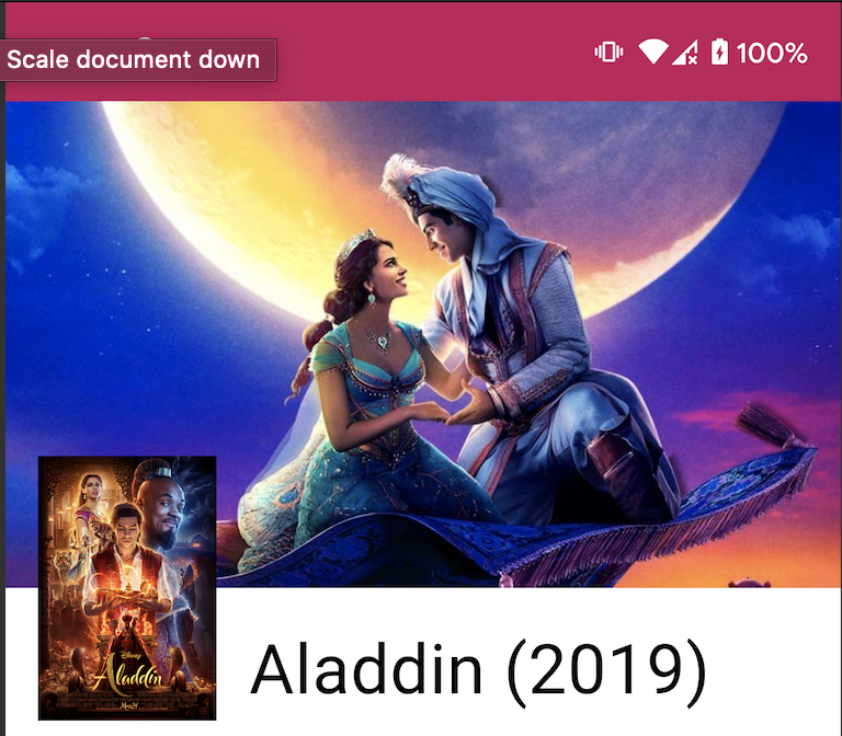
There is an awesome sample project on ConstraintLayout created by @riggaroo that showcases how to build a Google Play Movies detail like layout for the Android View System. In this post I’ll do a try to replicate it for Jetpack Compose as possible. Here is the final result:
|
|
|---|
The only goal is to showcase how to use ConstraintLayout composable by yourself, so don’t expect much magic on this first post but mostly the basics.
For loading images from a remote URL seamlessly I’ll be using Coil via the Accompanist library, by @chrisbanes. This library provides some utilities for projects in the process of migration to Jetpack Compose, like a theme builder to load theme colors from the closest Context, so you can keep using your XML themes and styles while doing the migration. Pretty interesting in my opinion.
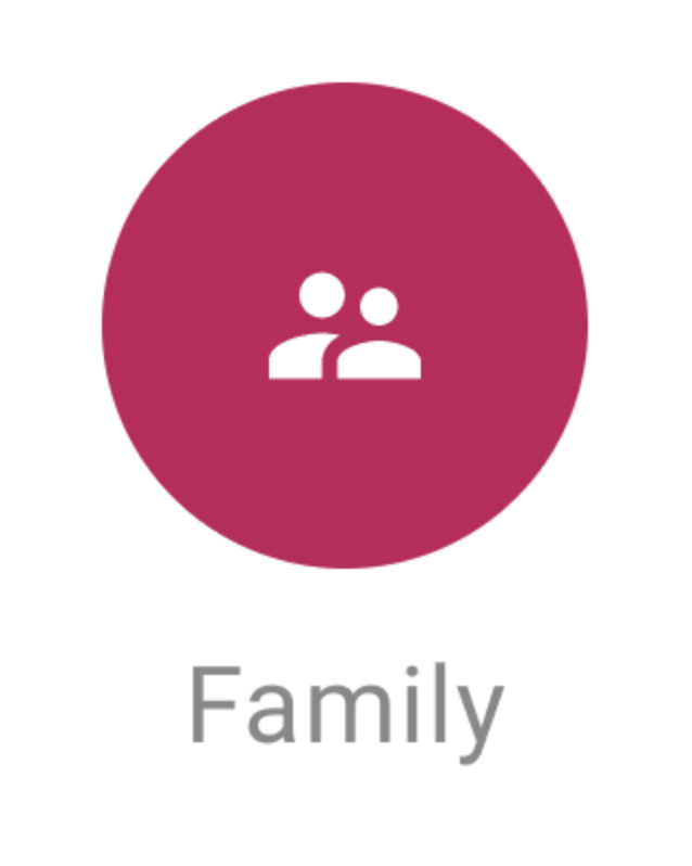
Let’s start by coding those rounded icon buttons on the image.
I decided to code those as a separate component for reusability. The component has an icon and a text inside. The name is RoundedIconButton, which gets a series of arguments: The tag, that will be used to reference composables within our layout declaration and that we’ll look into later, the image vector asset, a text to put below it and an optional background color.
@Composable
fun RoundedIconButton(
    tag: Tag,
    asset: VectorAsset,
    text: String,
    background: Color = lightThemeColors.primary
) {
    Column(
        modifier = Modifier.tag(tag) + Modifier.padding(16.dp),
        horizontalGravity = Alignment.CenterHorizontally
    ) {
        Image(
            modifier = Modifier.drawBackground(
                background,
                CircleShape
            ) + Modifier.padding(20.dp),
            asset = asset
        )
        Text(
            modifier = Modifier.padding(top = 8.dp),
            style = MaterialTheme.typography.body2,
            color = Color.Gray,
            text = text
        )
    }
}
By adding a Column I align the image and the text below it vertically, Then I impose center horizontal aligment for both things inside the Column with a modifier.
From the outside, we’ll be able to call it like:
RoundedIconButton(
    tag = FamilyCircleTag,
    asset = vectorResource(R.drawable.ic_family),
    text = "Family"
)
Where FamilyCircleTag is a simple: object FamilyCircleTag. This would be the visual result 👍
Let’s move on now into the actual ConstraintLayout code.
I will provide a new component representing my screen for this. Content will be into a VerticalScroller since I’ll want it to be scrollable in the vertical direction:
@Composable
fun GooglePlayScreen(movie: MovieViewState) {
  VerticalScroller {
    // My screen composable tree will live in here
  }
Time to to add our ConstraintLayout to the mix.
@Composable
fun GooglePlayScreen(movie: MovieViewState) {
    VerticalScroller {
	ConstraintLayout(
	  modifier = Modifier.drawBackground(color = Color.White) +
	  	Modifier.fillMaxWidth() +
	  	Modifier.fillMaxHeight(),
	  constraintSet = ConstraintSet {
	    // We'll add our initial constraints here!
	  }) {
	    // Our composables will be the composable children declared here.
	    // They will be constrained by the constraints provided above.
	  }
}
I’m imposing full width and height by modifiers, since I want this composable to take the whole screen.
Since Jetpack Compose composables don’t rely on ids for reference like in the View system, we need to create tags to refer to those within our constraints.
Let’s create a tag for our header image, and add some constraints to it:
private object HeaderImageTag

@Composable
fun GooglePlayScreen(movie: MovieViewState) {
    VerticalScroller {
	ConstraintLayout(
	  modifier = Modifier.drawBackground(color = Color.White) +
	  	Modifier.fillMaxWidth() +
	  	Modifier.fillMaxHeight(),
	  constraintSet = ConstraintSet {
	    val headerImage = tag(HeaderImageTag).apply {
	      top constrainTo parent.top
	      left constrainTo parent.left
	      right constrainTo parent.right
	    }
	  }) {
	    CoilImage(
                data = movie.headerImageUrl,
                contentScale = ContentScale.Crop,
                modifier = Modifier.fillMaxWidth() +
                  Modifier.preferredHeight(240.dp) +
                  Modifier.tag(HeaderImageTag)
            )
	  }
}
Note that we just need add the composable as a children of our ConstraintLayout, like I’m doing with my CoilImage. Remember to
tag the view with the the same tag used for its constraints ⚠️, using a tag modifier.
You can see how simple is it to constrain our views:
headerImage.top constrainTo parent.top
headerImage.left constrainTo parent.left
headerImage.right constrainTo parent.right
Now let’s add our movie cover image as a portrait:
sealed class Tag
private object HeaderImageTag : Tag()
private object PortraitImageTag : Tag()

ConstraintLayout(
  modifier = Modifier.drawBackground(color = Color.White) +
    Modifier.fillMaxWidth() +
    Modifier.fillMaxHeight(),
  constraintSet = ConstraintSet {
    val headerImage = tag(HeaderImageTag).apply {
      top constrainTo parent.top
      left constrainTo parent.left
      right constrainTo parent.right
    }
    val portraitImage = tag(PortraitImageTag).apply {
      left constrainTo parent.left
      top constrainTo headerImage.bottom
      bottom constrainTo headerImage.bottom
    }
}) {
  CoilImage(
     data = movie.headerImageUrl,
     contentScale = ContentScale.Crop,
     modifier = Modifier.fillMaxWidth() +
     	  		Modifier.preferredHeight(240.dp) +
     	  		Modifier.tag(HeaderImageTag))

  CoilImage(
    data = movie.portraitUrl,
    modifier = Modifier.preferredSize(120.dp, 260.dp) +
     		Modifier.padding(8.dp) +
     		Modifier.tag(PortraitImageTag))
   }
We align its top and bottom to the bottom edge of the header image, so that way we center it vertically to that line.
Let’s add a title now:
sealed class Tag
private object HeaderImageTag : Tag()
private object PortraitImageTag : Tag()
private object TitleTag : Tag()

ConstraintLayout(
  modifier = Modifier.drawBackground(color = Color.White) +
    Modifier.fillMaxWidth() +
    Modifier.fillMaxHeight(),
  constraintSet = ConstraintSet {
    val headerImage = tag(HeaderImageTag).apply {
      top constrainTo parent.top
      left constrainTo parent.left
      right constrainTo parent.right
    }

    val portraitImage = tag(PortraitImageTag).apply {
      left constrainTo parent.left
      top constrainTo headerImage.bottom
      bottom constrainTo headerImage.bottom
    }

    val title = tag(TitleTag).apply {
      top constrainTo headerImage.bottom
      left constrainTo portraitImage.right
      right constrainTo parent.right
      width = spread
    }
}) {
  CoilImage(
     data = movie.headerImageUrl,
     contentScale = ContentScale.Crop,
     modifier = Modifier.fillMaxWidth() +
     	  		Modifier.preferredHeight(240.dp) +
     	  		Modifier.tag(HeaderImageTag))

  CoilImage(
    data = movie.portraitUrl,
    modifier = Modifier.preferredSize(120.dp, 260.dp) +
     		Modifier.padding(8.dp) +
     		Modifier.tag(PortraitImageTag))
   }

   Text(
     movie.name,
     style = MaterialTheme.typography.h4,
     modifier = Modifier.padding(top = 16.dp) + Modifier.tag(TitleTag))
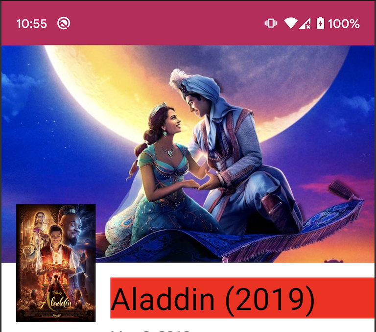
Note how we align the title:
title.top constrainTo headerImage.bottom
title.left constrainTo portraitImage.right
title.right constrainTo parent.right
title.width = spread
This will make it position below the header image, and to the right of the portrait image.
The spread width has the same effect than for the View system ConstraintLayout; Since our text is smaller than the available width space, we want it to take all the available space instead, so its content (the actual text rendered within the composable) gets aligned to the left per its gravity. Here’s the visual result with the text background in Red so you can see what I’m talking about:
|
|
|---|
And by following this pattern you can add the rest of the views. There are not any gotchas in there, so I’ll prompt you to have a look to the complete screen code here.
I plan on iterating a bit over this sample to add some interesting animations to the screen in future posts, so stay tunned 👍
Also keep in mind ConstraintLayout is not being promoted yet by the Jetpack Compose team, precisely because it’s prone to change, as many other apis. Keep that in mind when you use it 🙏
Remember that you’ll need Android Studio 4.2 Canary 1 to use Jetpack Compose.
You might be interested in other posts I wrote about Jetpack Compose, like:
I share thoughts and ideas on Twitter quite regularly. You can also find me on Instagram. See you there!
Stay tunned for more Jetpack Compose posts 👋