Dependency Inversion on Android Theming
The concept of DI is something we don’t use to associate with XML files like the Android resources. Let’s learn how Android uses it for theming apps.
Theme attributes
Let’s say we’re theming our app using one of the Material Components themes, and you want to fix the value for a couple of theme attributes. Your styles.xml file could look like this.
<!-- styles.xml -->
<resources>
  <style name="AppTheme" parent="Theme.MaterialComponents.NoActionBar">
      <item name="colorSurface">@color/dark_background</item>
      <item name="colorOnSurface">@color/light_over_dark</item>
  </style>
</resources>
And your colors.xml be something like:
<!-- colors.xml -->
<?xml version="1.0" encoding="utf-8"?>
<resources>
  <color name="dark_background">#121212</color>
  <color name="light_over_dark">#FFFFFF</color>
</resources>
So that is how your application theme associates a theme color attribute with a concrete color. If you dig just a little into the library code you’ll find those attributes are defined as custom Android attributes, usually into an attrs.xml file (file names are not relevant for the system).
<!-- attrs.xml -->
<?xml version="1.0" encoding="utf-8"?>
<resources>
  ...
  <attr name="colorSurface" format="color"/>
  <attr name="colorOnSurface" format="color"/>
  ...
</resources>
Finally, you can reference those theme attributes from your views.
<androidx.cardview.widget.CardView
    xmlns:android="http://schemas.android.com/apk/res/android"
    xmlns:app="http://schemas.android.com/apk/res-auto"
    xmlns:tools="http://schemas.android.com/tools"
    android:layout_width="match_parent"
    android:layout_height="match_parent"
    app:cardBackgroundColor="?attr/colorSurface">

    <TextView
        android:id="@+id/text"
        android:layout_width="wrap_content"
        android:layout_height="wrap_content"
        android:layout_margin="@dimen/spacing_medium"
        android:text="@string/welcome_message"
        android:textAppearance="@style/TextAppearance.MaterialComponents.Headline6"
        android:textColor="?attr/colorOnSurface" />

</androidx.cardview.widget.CardView>
The main difference between the ?attr/ syntax and the standard @color/ one is that with the former you’re reusing the theme attributes. I.e: if you decide to switch themes, your application will work transparently and get colors updated accordingly across the app.
That potentially leverages the design team to produce carefully defined color and style palettes to improve reusability and UI homogeneity.
Note that
?attr/colorSurfaceand the alternative syntax?colorSurfaceare equivalent. Both will lead to the same color resource under this scenario.
When you directly reference colors, your app is not prepared to swap themes unless we’re talking about a very specific (and ad hoc) case like DayNight themes, where the system is prepared to look for resources named equally for both theme modes. But that’s something very specific.
It’s also possible to reference colors as
?android:attr/. Those attributes must be defined in the Android SDK version being used as a target. Otherwise you’ll get a runtime inflation crash.
How’s that related to Dependency Inversion?
When you define custom attributes and make your complete app UI depend on those instead of on direct color references, those are working as an abstraction. The views don’t care about the underlying bindings provided for those colors, they just need to know about the custom attributes.
Note that I’m not using the word “bindings” here accidentally. If you take a look to your AppTheme, you’ll realize that’s where your color bindings (from custom attr to concrete color) are. So there’s a single place in your app where the associations are done, and the complete app can just depend on the abstractions.
That’s the concept of Dependency Inversion, and you can actually make good use of it under different scenarios.
How to make use of theme attributes
I can imagine a couple of good scenarios.
Swap app themes at runtime
This is sometimes requested by the product and/or design teams, when they want the app to support different themes depending on things like the user privileges under the platform. E.g: Default vs Premium users. They might want styles and colors to vary in those cases.
As described previously, the only way to swap themes at runtime is that all the views on your app reference theme attributes and never colors directly. Let’s say you got 2 different themes you want to use that bind the custom theme attributes to different color palettes:
<style name="AppTheme.Default" parent="AppTheme">
  <item name="colorSurface">@color/dark_background_default</item>
  <item name="colorOnSurface">@color/light_over_dark_default</item>
</style>

<style name="AppTheme.Premium" parent="AppTheme">
  <item name="colorSurface">@color/dark_background_premium</item>
  <item name="colorOnSurface">@color/light_over_dark_premium</item>
</style>
Then you can switch themes at runtime. Keep in mind views are themed during inflation, so activities need to be recreated for switching themes.
The process is essentially calling setTheme(themeResId) before setContentView() and also activity.recreate() when required.
Android views don’t work reactively to themes at this point so there’s not the chance to re-theme those without recreation. Some themes like
DayNightare able to do it without recreation but they’ve been coded by the Android team providing some ad hoc hooks in the correct places to make those work. It’s not something meant to be widely extended or reused at the time of writing this post.
override fun onCreate(savedInstanceState: Bundle?) {
    super.onCreate(savedInstanceState)
    setTheme(pickedThemeFromPreferences())
    setContentView(R.layout.activity_main)
}

// Somewhere else in the app after you select a new theme at runtime:
fun swapTheme(activity: AppCompatActivity, @StyleRes themeResId: Int) {
    val prefs = PreferenceManager.getDefaultSharedPreferences(this)
    prefs.edit()
        .putInt(PREF_THEME, themeResId)
        .apply()

    activity.recreate()
}
Libraries containing UI
This is probably the most widely used scenario. Here we can look at libraries like material. Those define a list of custom color attributes then make their views (the components in this case) depend on those with no exceptions. The library targets the abstractions all the way, and client projects that are depending on material extend their themes to provide bindings for those colors.
Within the library, both the theme styles and the color attributes that want to be exposed, are tagged as public so they can be referenced by clients.
When you take this approach, your library doesn’t need to depend on the client project, but vice versa, so the strict direction of the dependencies stays the same, but the lib is getting its attributes fulfilled by the client project.
Now your app can seamlessly swap themes for different scenarios and the library (or library module) is never affected.
That’s the nature of Dependency Inversion.
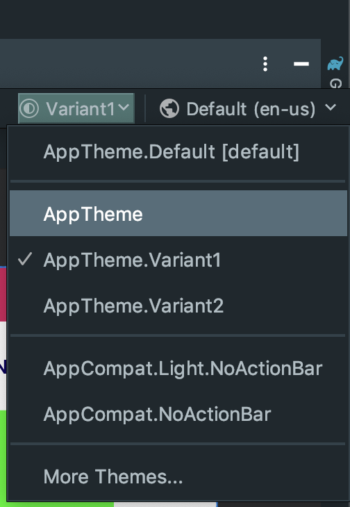
Layout Preview rendering
This is probably one of the big worries given preview is hugely used for coding UIs fast, but no fear. The preview knows how to render custom attributes as if they were direct references. You only need to select the proper theme in your preview menu so it gets the required bindings on the theme to know which colors they’re pointing to:
Final words
Note that what I’ve describe here is not only usable for colors but for any Android resources that can be defined as attributes 👍
If you’re interested in any topics regarding Android, feel free to keep an eye on my blog 🙏🏽. You can also follow me on Twitter or Instagram.
Want to support me?
If you reached this point you might consider supporting me for boosting my will to write. If that’s the case, here you have a button, really appreciated! 🤗
Supported or not, I will keep writing and providing content for free ✅
